It's time to get subjective: no technical talk, no summaries, just pure and simple "does this look good" kind of stuff. The 2022 F1 grid is probably the best looking grid in recent memory, but that doesn't mean that it's not without a lemon or two...
Images from teams' respective social media channels. Cars shown in alphabetical order.

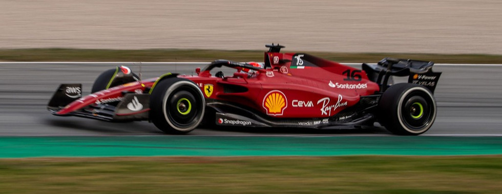
Less really is more, huh. After 25 years of Marlboro and Philip Morris control, Ferrari finally have complete creative control over their car's appearance once again. At the end of the day, it's a red car with stickers on it, with black wings. Nothing crazy. But, the shade of red is excellent, and the car has more of a satin finish than the all-out matte look that the team has sported for the last three years. The little neon yellow aspects are a neat callback to 90's Ferrari F1 cars. Let's just hope this car is more competitive than the ones it shares its livery with.

Like the Ferrari, this car is essentially two colors, with one being the main focus and the other serving as an accent. Last year saw the return of "British Racing Green" and while the car looked good in the right light, other times it fell flat. Also, the last-minute BWT watermelon pink addition was not great. This time, they've corrected the green to look more green and less teal/black, and also have added the lime green accents that many Aston Martin GT race cars use. The end result is great, although I still don't quite get the black fake-sidepod area next to Peroni. If that was green, maybe it would be number 1.

Alfa Romeo first appeared on the 2018 Sauber, and every year since, they seem to get a little better at making a great looking car (even if they aren't making a fast one). This year sees the most radical changes yet, with a simple red car with a white slash in the midsection. It looks as if the mid-2000s Toyotas and the Marlboro McLarens had a baby, but there could be worse looking cars to take inspiration from. The fact that the Orlen red and the Alfa Romeo red are different and next to each other isn't great, as is the blank space on the side under the Alfa Romeo text. Bonus points, though, for having the best interpretation of the new wheel covers.

Realistically, AlphaTauri need to get a better render person or team, because each year the new car is shown off, the real livery looks much much nicer than in the initial renders. This is their best effort yet, with the front half of the car especially looking so good. The car looks a little messy from some angles, and the massive text on the front wing is not exactly easy to read, so that's not ideal. Generally speaking though, it looks really good, and this is probably one of the few times they can say they outdid the larger Red Bull team...

Even more than the AlphaTauri, the Williams had a huge glow-up from reveal to release. This car just looks better each and every time I see it, although it should be noted that when I first saw it, I thought it was a mess. The geometrical patterning is a good way of covering up the fact that the team is lacking sponsorship at the moment, and the fact that the sidepods are so bizarrely short helps to break this up even further. I like the red, although I think it realistically should've been white to keep more in line with Williams' traditional colors.

To me, this is the most medium livery I have ever seen. There's nothing inherently wrong with it. It's functional, you can tell that it is silver, the team is sponsored by Petronas and Ineos, and that it is a Mercedes. That's the job description. The driver numbers, as they were last year, are way too hard to read, and although you can't really see them here, there are a handful of three-pointed stars on the engine cover that seem to have a different level of reflection compared to the rest of the car, which is odd. Meh.

The Red Bull livery is like the Hollywood movie star that keeps getting plastic surgery to maintain their appearance, even though their natural body shape changes. This, in my opinion, is the worst of the lot. The white text of lucrative new sponsors Oracle and Bybit really clash with the traditional blue, yellow, and red look in my eyes. I don't like how you can't see the sponsor on the rear wing from most views. I also don't like how you can't really see any 'Red Bull' text, which is a shame, because it's quite iconic and stands out. It's there, but the combination of the car shape and the angles of the picture mean that you can't see them. A new sponsor would've given the team the perfect opportunity to make a full livery change, but instead they further corrupted one of the more iconic livery designs of all time even further.

It's orange. That's good, it should be orange. The blue has been an interesting accent color, albeit not that great in 2020 or 2021 when the team switched to matte. This year, the orange is even brighter, and the blue is more of a tropical teal than a true blue, which is apparently a nod to the Gulf design the team ran last year. But it's not the same blue, so what's the point? It's very hard to read the numbers, but the side of the car is what really lets it down though. Most teams have secondary sponsors that they place on the car near the floor or bottom of the chassis, but McLaren instead have a black line right across the side of the car, seemingly arbitrarily, where they put these sponsors instead. This leaves an awkward amount of space behind the driver's head, where there's just a block of orange. It has good intentions but needs a better balance. The Ferrari and the Aston make 2-color liveries look effortless. The McLaren makes it look awkward. Enough said.

Alpine had one of the top 5 liveries of the last 10 years on last year's car, but this year they've definitely fallen from grace. I do feel bad for the designers though, because they definitely had their hands tied. What this looks like is that BWT came in late, and the team already had all of their merchandise and livery done, when suddenly they were told "It's gotta have pink on it" and this is the result. I do think the halo should've been pink as well, but realistically the blue and pink just don't match. They should be separated by some neutral color (white, I think) which would break this up better and not look so jarring. Also, the car looks like it's from Baskin-Robbins.

With the previous look tarnished by world events, Haas will have to change their look this year, some way or another. How will they do it? I don't know, so I can't rate it. I think they will stay with a white base, though. After all, they would be the only white car on the grid this year, so it would actually stand out. But they need something more than what they ran in testing. That was crisis mode, not the final design. At least, let's hope so.
What do your rankings look like?


Comments